GOVERNMENT TOOLS
CONSULTING


Australia's death rate keeps falling – but not equally everywhere


Glenn Capuano
Lead Demographer – Customer Success and Support
- 188,421 deaths were registered in 2025, 1,153 more than in 2024. But once you allow for the changing age of the population, the death rate is close to the lowest it's ever been.
- The standardised death rate was 4.955 deaths per 1,000 people in 2025, down from 5.078 the year before.
- Socio-economic status is closely linked to death rates – the LGAs with the lowest death rates are also among the most advantaged in the country.
- Of the 379 LGAs with a published rate in both periods, 305 (about four in five) had a lower rate in 2023–2025 than in 2011–2013.

The ABS has released Deaths, Australia, the annual publication counting deaths across the country and by local area, now current to the 2025 calendar year. While it's not the cheeriest of topics, it's mostly a good news story.
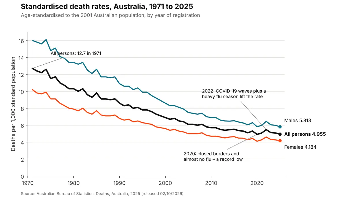
The number of deaths keeps rising as the population grows and ages – 188,421 deaths were registered in 2025, 1,153 more than in 2024. But once you allow for the changing age of the population, the death rate is close to the lowest it's ever been. The standardised death rate was 4.955 deaths per 1,000 people in 2025, down from 5.078 the year before. That's a record low for males (5.813), and the second-lowest on record for females (4.184) and for the population as a whole – in both cases just behind 2020.
What is a standardised death rate?
A simple or 'crude' death rate divides the number of deaths by the population. In 2025 that was 6.823 deaths per 1,000 people – higher than 10 years ago (6.678 in 2015). That doesn't mean we're less healthy; it mostly reflects an older population, since older people are more likely to die in any given year.
The standardised death rate removes the effect of age. The ABS applies each year's age-specific death rates to a fixed 'standard' population – currently we’re using the Australian population of 2001 – so we can compare years, and places, as if they all had the same age profile. It's the best single measure of whether mortality is actually improving.
Fifty years of falling death rates
This chart tells the story of our declining death rate over the past half century. The all persons rate has fallen from 12.7 per 1,000 in 1971 to just under five today – a drop of more than 60%. Male rates have always been higher than female rates, but the gap has narrowed a lot, from almost six deaths per 1,000 in the early 1970s to about 1.6 now.
Source: ABS, Deaths, Australia, 2025 (Data Explorer, Deaths summary data). Chart: Informed Decisions.
You can clearly see the effect of COVID-19 here. The rate dropped sharply in 2020, when closed borders, lockdowns and social distancing meant there was almost no flu season and the early COVID pandemic was largely kept out of the country. It then jumped in 2022 to 5.476 – an 8% rise on 2021 – as COVID-19 spread widely for the first time, alongside a heavy flu season. Since then it's settled back into the long-term downward trend, with the pandemic appearing as only a blip in the wider scheme of things.
Living longer
The median age at death was 79.7 for males and 84.6 for females. Note this isn't the same as life expectancy, which is calculated from birth using age-specific death rates (updated life expectancy data will be released on 10/12/2026 by the ABS). Though these ages are very close to the current life expectancy at birth from 2022-2024 (81.1 years for males and 85.5 for females). The next version of this will be from 2023-2025 so expect a jump in life expectancy as the COVID deaths year of 2022 drops off the 3-year average.
Infant mortality – still among the lowest in the world
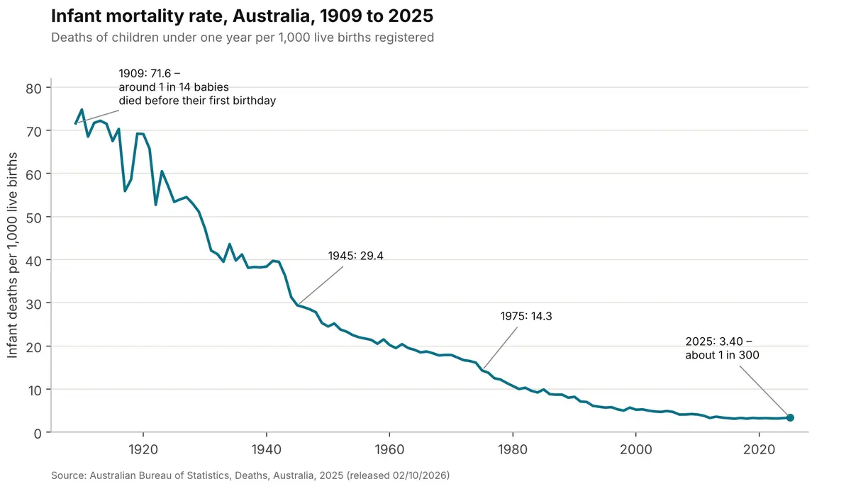
Infant mortality rose slightly in 2025, to 3.40 deaths per 1,000 live births (1,019 infant deaths, up from 957). While it's up a little, Australia's rate remains one of the lowest in the world, and the change isn't even noticeable on this chart (one of my favourites), which shows the incredible fall over the last century.
Source: ABS, Deaths, Australia, 2025. Chart: Informed Decisions.
In 1909, about one in 14 babies died before their first birthday. Today it's about one in 300. This is the single biggest contributor to the rise in life expectancy over the last century – far more than gains at older ages. Even within my own lifetime (since the mid-70s) we’ve fallen from around one in 70 babies dying before their first birthday to one in 300 today.
Where you live still matters
It's not all good news, of course. The averages hide some big differences between groups and places.
Aboriginal and Torres Strait Islander people continue to have a death rate around double that of the total population: 10.0 deaths per 1,000 standard population (averaged over 2023 to 2025, for the five states and territories with enough data to measure it reliably), compared with 4.955 nationally. The median age at death for Aboriginal and Torres Strait Islander people was 63.5 years.
States and territories differ too. The Northern Territory had the highest standardised death rate in 2025 (7.241) – partly due to the high Aboriginal population, and the ACT the lowest (4.501).
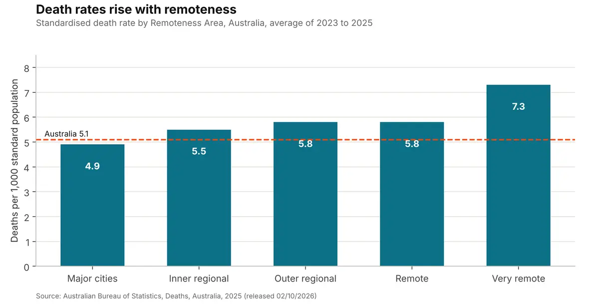
Remoteness makes a clear difference. Averaged over 2023 to 2025, the death rate in major cities was 4.9 per 1,000, rising to 5.5 in inner regional areas, 5.8 in outer regional and remote areas, and 7.3 in very remote Australia. Access to health services, distance, occupation and the larger share of Aboriginal and Torres Strait Islander people living in remote areas all play a part.
Source: ABS, Deaths, Australia, 2025, Table 6 (Remoteness Areas). Rates are three-year averages. Chart: Informed Decisions.
Death rates and socio-economic status
Socio-economic status is closely linked to death rates – the LGAs with the lowest death rates are also among the most advantaged in the country. To see how strong that link is, we've compared the death rate for every LGA with a published rate against its SEIFA score.
What is SEIFA? The ABS Socio-Economic Indexes for Areas (SEIFA) rank areas using Census information such as income, education, employment, occupation and housing. We've used the Index of Relative Socio-economic Disadvantage (IRSD), from the 2021 Census. The Australian average is set at 1,000 – a lower score means an area is more disadvantaged. You can find your area's SEIFA scores in its Community Profile.
LGA death rates are averaged over three years (2023 to 2025) to smooth out the year-to-year noise you get with smaller numbers. The ABS doesn't publish a rate for areas with very few deaths, so many of the smallest LGAs – particularly remote Aboriginal shires in Queensland, WA and the NT likely to have high death rates – aren't included. This means the true range is probably even wider than shown here.
The highest death rates
Across the country, the LGAs with the highest death rates were:
| Local government area | State | Standardised death rate, 2023–2025 | SEIFA IRSD score, 2021 | IRSD decile (1 = most disadvantaged) |
|---|---|---|---|---|
| Derby-West Kimberley | WA | 10.4 | 734 | 1 |
| Roper Gulf | NT | 9.8 | 534 | 1 |
| Walgett | NSW | 9.8 | 888 | 2 |
| Wyndham-East Kimberley | WA | 9.5 | 899 | 2 |
| Coonamble | NSW | 9.3 | 883 | 1 |
| Bourke | NSW | 9.2 | 947 | 3 |
| Port Hedland | WA | 8.9 | 1,011 | 8 |
| Katherine | NT | 8.5 | 961 | 4 |
| Narrogin | WA | 8.2 | 964 | 4 |
| Gwydir | NSW | 8.1 | 957 | 4 |
Sources: ABS, Deaths, Australia, 2025, Table 5; ABS, SEIFA 2021 (LGA). Deciles are national rankings of LGAs.
Most are in remote or very remote areas of WA, the NT and western NSW. Five of the 10 fall into the most disadvantaged 20% (two deciles) nationally. Derby-West Kimberley has the highest rate in the country – though with relatively few deaths each year, rates for smaller populations like this can move around a lot, which is why the ABS averages them over three years.
Aboriginal and Torres Strait Islander people make up a large share of the population in most of these areas. In eight of the 10, it's at least 18% – almost one in five residents – compared with 3.2% nationally, and in Roper Gulf it's three-quarters. That fits the national picture, where the Aboriginal and Torres Strait Islander death rate is around double that of the total population. It reflects a number of factors that tend to go together in these places: remoteness, long distances to hospitals and specialist care, fewer local health services and long-standing socio-economic disadvantage.
Port Hedland stands out, with a SEIFA score above the national average – but a death rate of 8.9. It's a good example of SEIFA measuring an area's average circumstances rather than everyone in it. High mining incomes lift the overall SEIFA index and mask a lot of inequality within the town. Around 18.5% of residents are Aboriginal and Torres Strait Islander – almost six times the national share – and while the town has a well-equipped regional hospital, specialist and intensive care services can mean a long flight down to Perth.
The lowest death rates
In contrast, the LGAs with the lowest death rates were:
| Local government area | State | Standardised death rate, 2023–2025 | SEIFA IRSD score, 2021 | IRSD decile (1 = most disadvantaged) |
|---|---|---|---|---|
| North Sydney | NSW | 2.8 | 1,096 | 10 |
| Mosman | NSW | 2.8 | 1,110 | 10 |
| Lane Cove | NSW | 3.1 | 1,105 | 10 |
| Nedlands | WA | 3.4 | 1,115 | 10 |
| Ku-ring-gai | NSW | 3.5 | 1,108 | 10 |
| Willoughby | NSW | 3.5 | 1,075 | 10 |
| Woollahra | NSW | 3.5 | 1,110 | 10 |
| Joondalup | WA | 3.6 | 1,072 | 10 |
| Adelaide Plains | SA | 3.6 | 988 | 6 |
| Strathfield (equal 10th) | NSW | 3.7 | 1,011 | 8 |
| Burnside (equal 10th) | SA | 3.7 | 1,083 | 10 |
Sources: ABS, Deaths, Australia, 2025, Table 5; ABS, SEIFA 2021 (LGA). Strathfield and Burnside are equal 10th.
It's a remarkably stable list – all 10 of the lowest LGAs for 2022–2024 appear again here. North Sydney and Mosman are down to 2.8 deaths per 1,000 – just over half the national rate, and less than a third of the rate in Derby-West Kimberley. Nine of the 11 are in the most advantaged decile in Australia, and they're mostly in Sydney's north shore and eastern suburbs, Perth's western and northern suburbs and Adelaide's east. In all but one of them, Aboriginal and Torres Strait Islander people make up less than 1% of the population (Adelaide Plains, at 2.6%, is the exception).
Adelaide Plains is the exception, with a SEIFA score just below average and one of the lowest death rates in the country. With only around 50 deaths a year the rate can be volatile, and it's the kind of result that's worth exploring with local knowledge.
How strong is the link?
This plot showing every LGA shows the pattern clearly. As SEIFA scores rise (less disadvantage), death rates tend to fall.

Sources: ABS, Deaths, Australia, 2025 (LGA rates averaged 2023–2025); ABS, SEIFA 2021 (IRSD). Analysis and chart: Informed Decisions.
It's a clear pattern: the higher an area's SEIFA score, the lower its death rate tends to be. But disadvantage doesn't explain everything – remoteness, access to health services, the make-up of the local population and plain chance all play a part.
Some of the most interesting stories sit below the line. Fairfield, Cumberland, Canterbury-Bankstown and Greater Dandenong are among the most disadvantaged LGAs in our major cities, yet all have death rates below the national average. All four have large overseas-born populations, and overseas-born Australians have a death rate around 20% lower than those born here (ABS publishes death rates by country of birth in Deaths, Australia, 2025). This is often called the 'healthy migrant effect' – people who migrate tend to be in good health, partly because of visa health requirements.
Two cautions are worth keeping in mind. First, this is a comparison of areas, not people – it tells us about places, not about any individual's chances. Second, SEIFA is from the 2021 Census, and some areas will have changed since. The 2026 Census will give us an updated picture in 2028.
Falling almost everywhere – but not quite
Most areas have seen their death rate fall over the long term. Of the 379 LGAs with a published rate in both periods, 305 (about four in five) had a lower rate in 2023–2025 than in 2011–2013. But 55 went the other way, and they're mostly in regional and remote areas – places like Walgett, Coonamble, Gwydir, Bland and Longreach in NSW and Queensland, and Derby-West Kimberley and Narrogin in WA. So while most of Australia is sharing in falling death rates, the gap between the places with the lowest and highest rates hasn't closed, but continues to widen in some places.
Why death rates matter for population forecasts
Deaths are one half of 'natural change' – the difference between births and deaths – which, along with migration, drives population growth. In ageing areas, particularly in regional Australia, deaths are increasingly outnumbering births, so natural change is already negative in many places, and population growth depends on people moving in. The ABS has just released the deaths dataset for 2025, but births is about a month later, due for release on 6/11/2026.
That's why we track both sides of the equation closely in Informed Decisions' population forecasts. Mortality assumptions shape how many older residents an area will have, and how fast that group grows – which matters for planning aged care, health services and housing for older people. But for most areas, births rates are now declining faster than death rates. Australia's fertility rate has been falling for some time and is now well below replacement level, with 2024 being a record low of 1.48. The number of births flows directly into future demand for maternal and child health services, kindergartens and schools. When the ABS releases Births, Australia, 2025 in November, we’ll look at what the new births data shows and start the next national forecast update incorporating those figures.
Explore the data. See the births, deaths and migration behind your area's future population in our Population Forecasts, and SEIFA scores and other demographic characteristics in our Community Profiles – just choose your council from the list. Or get in touch with our team to talk about what these trends mean for your community.
References
- Australian Bureau of Statistics (2026), Deaths, Australia, 2025, released 02/10/2026 – summary statistics, Tables 1 (country of birth), 5 (LGA) and 6 (Remoteness Areas).
- ABS Data Explorer, Deaths, Year of registration, Summary data, Sex, States, Territories and Australia (DEATHS_SUMMARY) – standardised death rates for persons, males and females, 1971 to 2025.
- Australian Bureau of Statistics (2023), Socio-Economic Indexes for Areas (SEIFA), Australia, 2021 – IRSD by LGA (via the Informed Decisions Duckberg data mart).